About
Fluid is a 3D video game project made as a team, for our studies' graduation.
Its uniqueness was to mix the dungeon crawler genre with a battle system based on rhythm.
Most of the development was made over in a year and a half.
In details
Technical stack
- Game engine : Unity 5.6
- Language : C#
- 3D Modeling : Autodesk 3DS Max
- 3D Texturing : 3D-Coat
Team
- Michaël Hubert : Lead Developer, 3D Artist, UI Artist
- Alexis Daniel : Lead Game designer, Storyteller, Level designer, Sound designer, developer
- Rémi Pauchet : Lead 3D Artist, 3D Animator, Level designer, Mocap actor
- IUSKID : Composer
Trailer
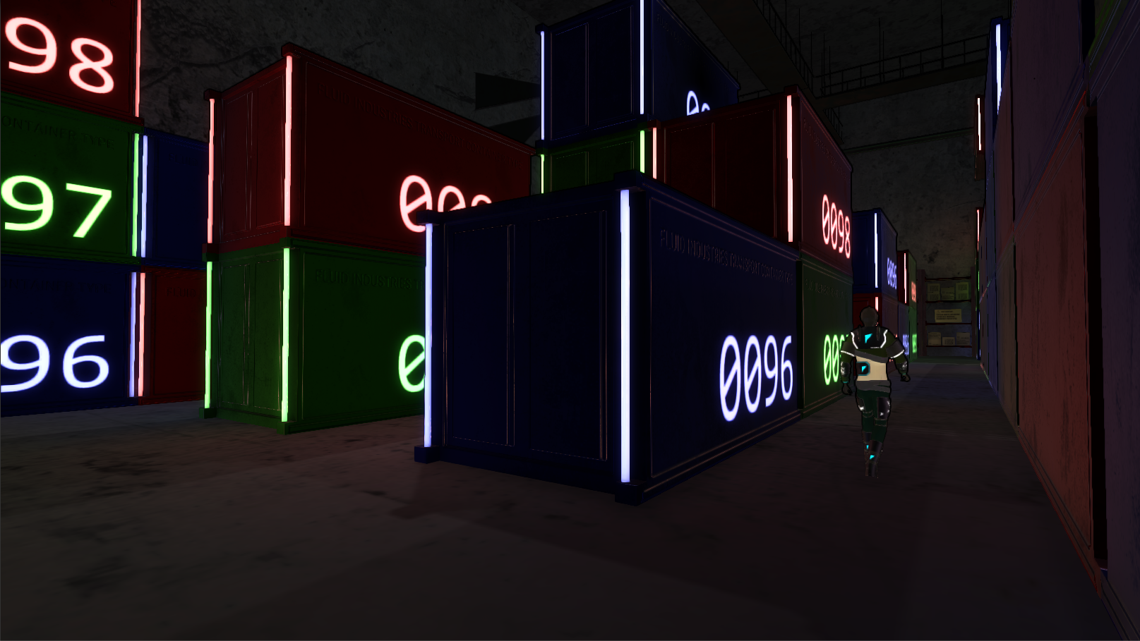
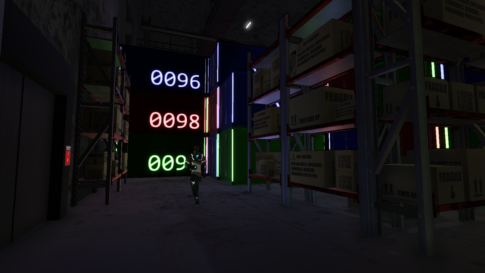
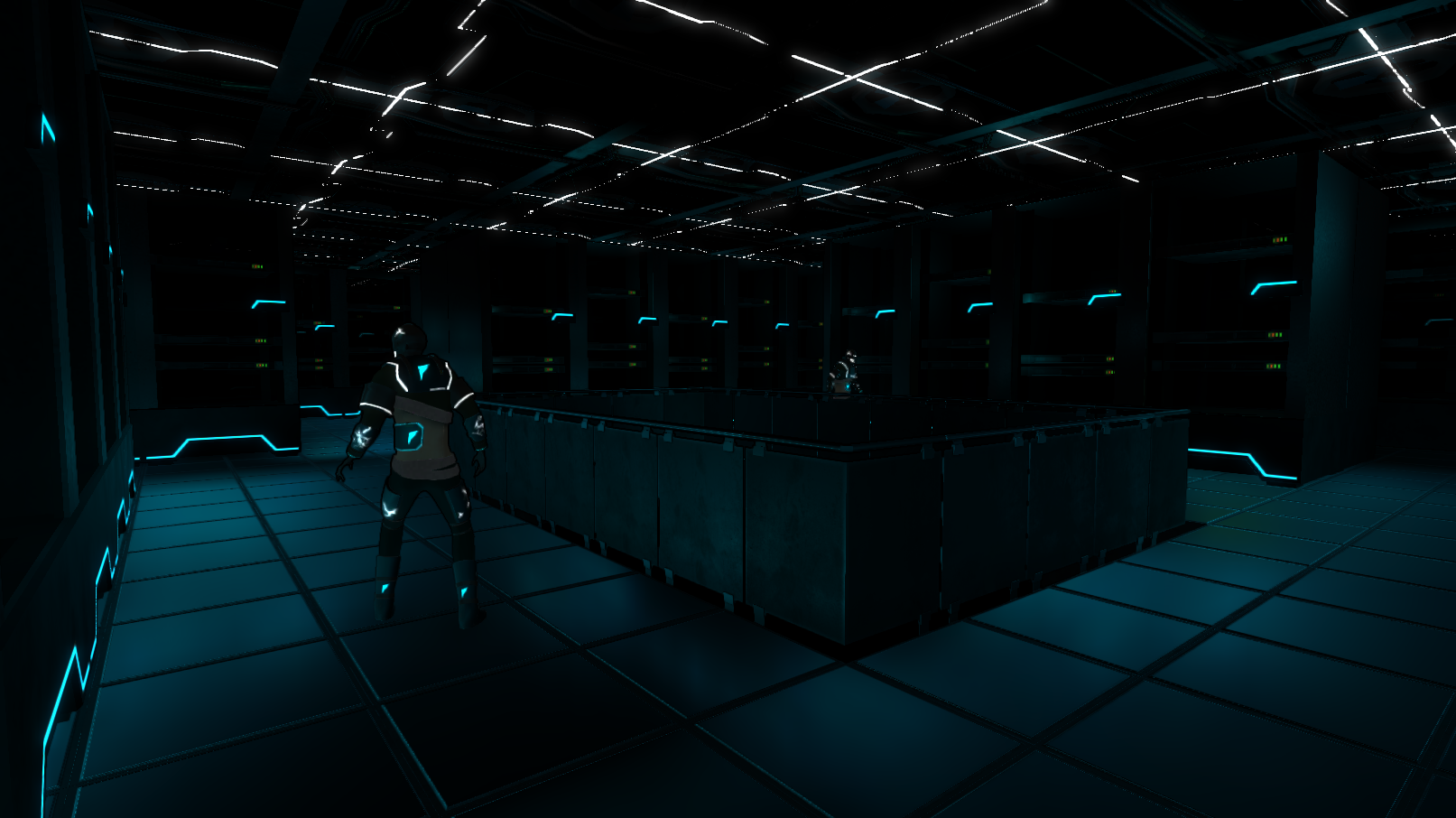
Screenshots
Production
In early 2016, our first proposal made to our school jury was the creation of a randomized dungeon crawler, using a Kinect to summon attacks and a Wiimote held on the forearm to navigate around the user interface.
Our group made 4 prototypes to try different gameplays : free or grid-based battle movement, different usage of attacks...
The proposal being accepted by the school, we made a newer "vision" prototype which had to look like what we wanted to achieve. The game is thus called "Fluid".

For a few months, we entierly rethought the gameplay following the feedbacks about the first prototypes. The battle system would then become turn-based with ATB.
The next prototype had to show our ideal vision of what it should be in terms of gameplay, graphics and music, which is why we were allowed to use existing assets. From now on, the game is named "Fluid".
The game development seriously begins at the start of the school year in September 2016, with the pre-production phase where a lot happens : further gameplay changes, choosing a graphic style, coding the game foundations, defining the pipeline workflow for 2D and 3D assets...
A prototype version of the game was showcased in October 2016, containing only a test battle and a piece of level modeled by ourselves.
At the beginning of the production phase, effort is put on the 3D modeling of the first level and on revamping the battle user interface.
Many playtests were conducted, to check if our gameplay was appreciated and understood by the players. Our battle system being so unique, its understanding was often difficult : we then understood that a readable interface and numerous feedbacks were a must have. Alpha version of the game was finished in February 2017.
The development advances as planned. The first level is starting to have its gameplay integration being complete : tutorial, exploration, traps, foes... and the battle system gets some enhancements to be more fun.
Battle is getting way better by the addition of motion capture animations for the player's attacks. Beta version would be finished in March 2017.

The biggest evolutions happened in the last months of the development timespan, with an extensive and iterative work on some details. The user interface is prettier and more ergonomic than ever, and an Options as well as a Pause menu are now avaliable.
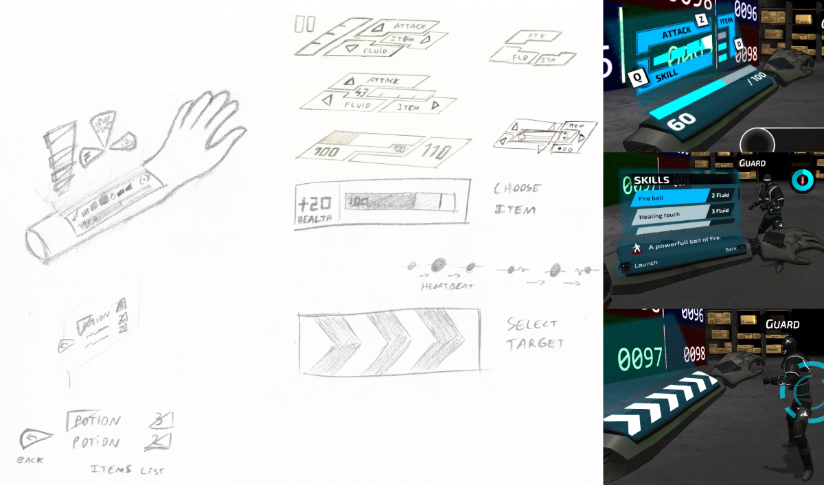
The battle system is now offering a skills set, which the player have to unlock through an exploration of the different levels, and which gradually power up by using them in battle. An accessibility option is also available, as you can choose one among two fonts made for dyslexic people.
As planned, the game is finished upon the school deadline, at the end of June 2017.
UI Design
For the game title screen, I decided to replace the common "Press Start" by reusing a gimmick of our battle gameplay: pressing a button in rhythm. Thus, the player learns how to play right from the start without even noticing it.
After that, the camera pans around the logo and the 3D space main menu is finally seen. For practical reasons, the "Resume" option will be selected by default if a savegame already exists.
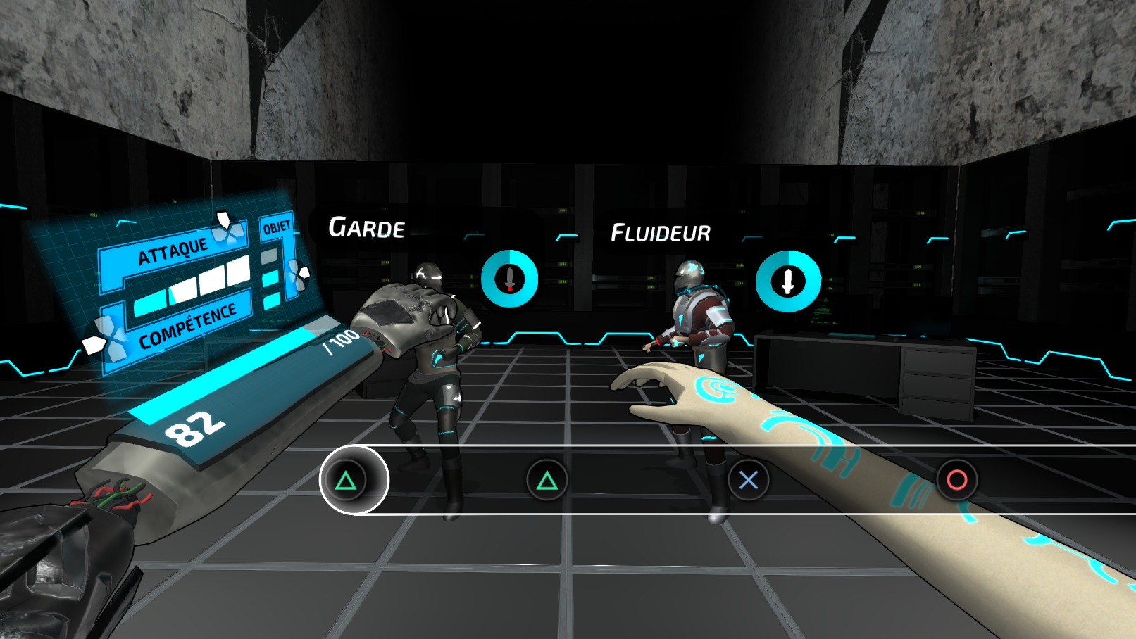
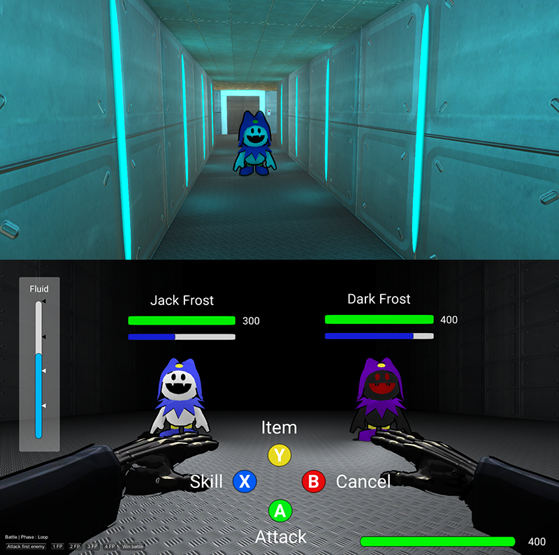
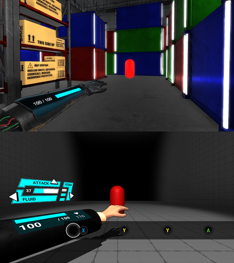
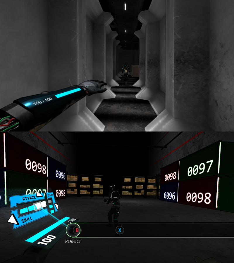
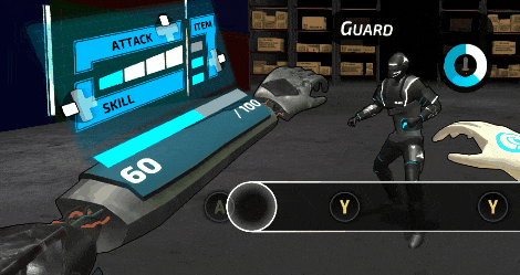
The game stays in a first-person view in both exploration and battle mode, with the main UI being a futuristic hologram over the forearm of the player.
While exploring a level, the arms are usually hidden from the view, but with getting nearby an interactable object, the left arm raises up to show the holographic UI again.
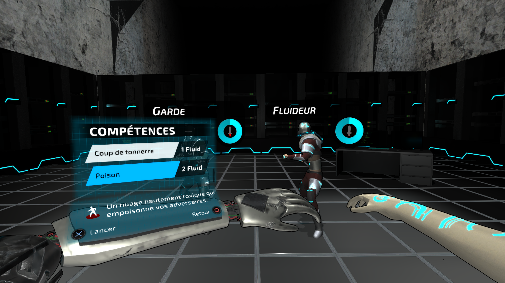
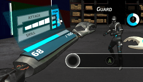
In a battle, the holographic UI is divided in two parts. The main upper part shows the navigable menu, and the lower part displays additional information. To ensure a fast and obvious navigation, each menu (Attack, Skill, Item) is associated to a single controller button or keyboard key.
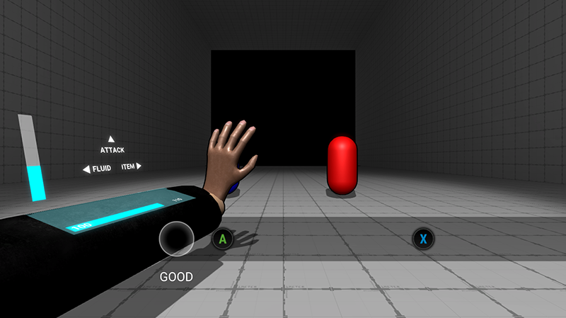
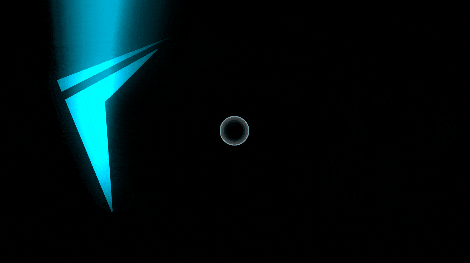
The rhythm system lets you charge your Fluid points, and hitting the keys on rhythm will shows you the accuracy with an extra visual effect upwards the holographic screen so that you know if you've charged enough or not to attack.
On top of the enemy can be seen its remaining health as a circular bar, as well as the ATB-like countdown before its next attack.
The battle UI being one of the most critical part for players to fully understand the gameplay, it was iterated many times and went over many playtests until players understood more what was shown on screen.
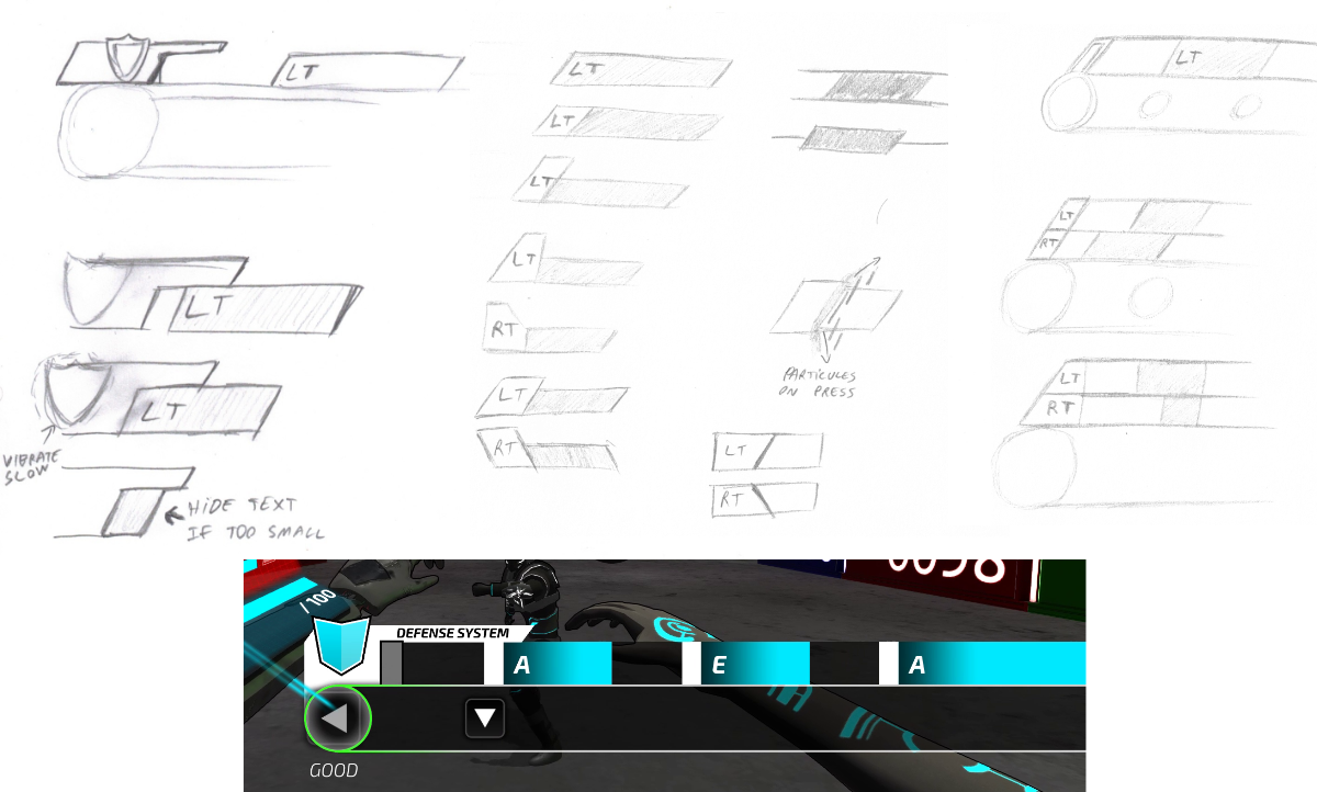
As for the defense system in which you had to counter the enemy attack while still being able to charge your Fluid points, it was critical to display the keys differently as you had to press them for one or two seconds. Even if the controller triggers keys were chosen as the defense keys, it was difficult to decide on two or one rows, with tilted keys that looked like the trigger buttons. But to keep a straightforward display, I settled on a single row with straight keys.
3D Modeling
Besides my other roles on the project, I've modeled and textured a few 3D assets for the "Warehouse" and "Datacenter" environments.